ENVIROLAMP
UX Case Study - 8 weeks project
is an application designed to monitor daily household consumption, helping reduce personal environmental impact
by promoting sustainable habits.
When the user is naturally interested in saving money,
their motivation to engage in saving actions increases.

The Challenge
is to address the issue of the climate crisis so we could help bridge the action-awareness gap.
we chose to aim to a daily-routine app, where people have a huge impact while being effortless.
providing an environmentally friendly space, will demonstrate the benefits of saving and increase motivation.
By connecting with the community and friends, we can overcome the feeling of isolation in our struggles.
The Solution


Our Goals
Bridge the action gap
Accessible information
A sense of community
Process
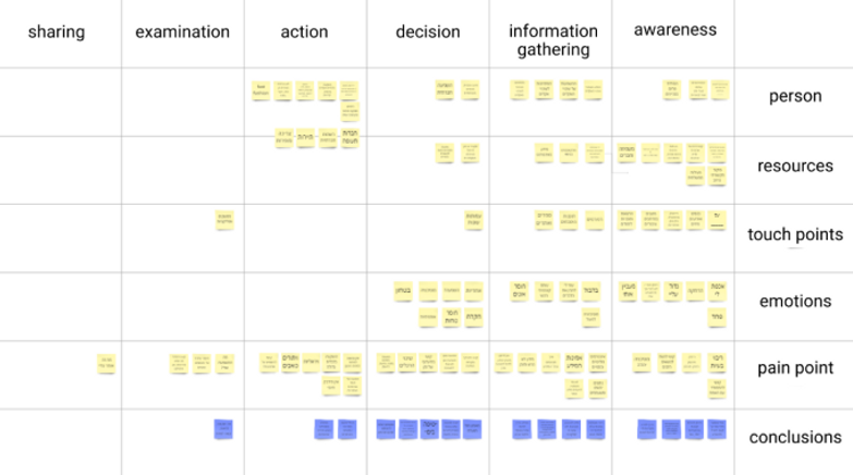
For the initial user research, we conducted a wide research to understand the current problems. During the define phase, I used affinity mapping to analyze pain points and determine priorities. Then we generated task flows to under-

Desk research
Market research
User research
User research

Journey map
Persona
stand where in the process users were having troubles, created Lo-Fi sketches and Hi-Fi clickable prototypes. At the end, I was able to validate with users and confirm the pain points are solved by the redesign.

Information Architecture
User flow
Wireframes
Lo-Fo

Hi-Fi
UI design
Conclusion
DISCOVER
DISCOVER
Desk
Research
Enough sources of information about the crisis
Education, campaigns, media, government etc.
Various issues within the bigger problem
There is a lot of conflicting information,
and it's not clear what is more important.
Possible ways to act
Green consumption, transportation,
reduced consumption, recycling, investing in green businesses, and raising awareness for the environment.
Market Research
DISCOVER
Earth Hero
Tracks carbon emissions via a survey, shows user's location compared to others, and suggests actions to reduce carbon.
Strengths
-
Easily displays my consumption level
(also compared to others) -
Provides accessible actions to take
Weaknesses
-
Too many actions can be overwhelming
-
Dependent on user-provided data
-
No motivation for repeated actions.
Skyscanner
Skyscanner offers the option to choose a flight with smaller environmental impact
Strengths
-
Creates a connection to reality
-
Raises awareness
-
doesn't interfere the user flow
Weaknesses
-
Incentives for action are held back
by economic factors -
Limited to specific information only
Forest
Helps you stay focused and productive by discouraging phone usage. The app also donates to planting real trees
Strengths
-
Visual and attractive
-
Motivating to take action Provides a sense of community
Weaknesses
-
The result doesn't extend beyond the app
-
No knowledge enrichment


User Research
DISCOVER

Dani / 20 / Hadera
-
Aware but knows little
-
Doesn't really care
-
Minimal actions on the way
-
Limited time, money and care
" Until now I didn't care a bit "

Noa / 25 / Jerusalem
-
Knows and aware
-
Cares about the environment
-
Trying to act where possible
-
Limited time, money and convenience
“ I would like to think that what I do has an impact ”

Eilam / 23 / Brener Hill
-
Highly aware
-
Cares a lot about the environment
-
Doing everything he can
-
Limited in time and money
“ We have to come together
to make an impact “
Our three interviewees pointed out a recurring pain point,
which is the lack of time and money they have available.
DEFINE
Ideation
DEFINE
Persona
DEFINE
After attempts to consolidate and combine all the findings from the research, we had a moment of realization. Following the journey mapping, We noticed something interesting - for each step, there was something to add pretty easily, but right after the “Action” the thoughts suddenly stopped.
We saw this as a window of opportunity to explore the needs of the market.
To help communicate information about users that we collected during research, we created a provisional persona.
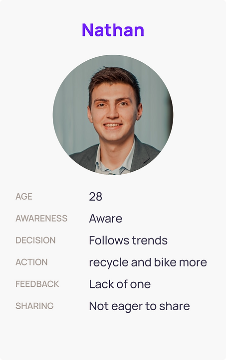
In short
conscious of the environment and tries to contribute in a convenient way. However, they are constrained by limitations of time, money, and convenience
Core needs
-
Guidance in an
-
unfamiliar field
-
Environment that resembles him
-
Making life more manageable
-
Simplifying the daily grind
Frustrations
-
Confused by conflicting sources of information
-
Doesn't like to put in effort if it's for nothing
-
Busy with his life and problems and doesn't want to add
-
more problems on himself
Personality
Analytical
Organized
Busy
Passive

I can act more. What prevents me is primarily a change in mindset and perception, as well as costs.
Base on the pre-research and the persona,
we wanted to address in our interface to the following guidelines:
Immediate
Sustainable consumption
Effortless
Sense of community
Feedback
DEVELOPE
While creating sketches, we considered incorporating an environmentally-friendly and socially-conscious approach at each stage.
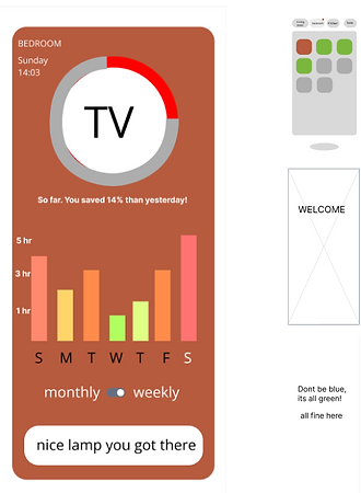
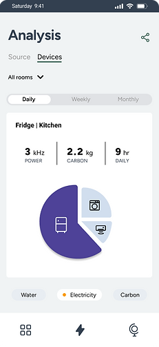
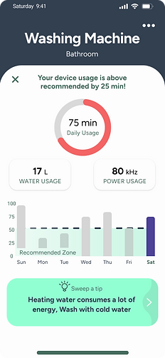
For the devices, we prioritized making the information easily accessible and visually appealing, rather than just presenting it in a list. Similarly, in presenting the data, we opted for a visual approach, rather than just numerical
Feedback
Sustainable consumption
DEVELOPE
Info.Arc
To help communicate information about users that we collected during research, we created a provisional persona.

-
Make the data updates more playful and light
-
“Social screen” moved to the main tabs
-
Measure savings was added to the social screen
Progress of the Lo-Fi screens


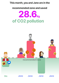
Sense of community
Immediate


Sense of community
Feedback
In the lo-fi stage, in addition to refining the UX, we also focused on emphasizing the green element on every screen, making it easy for the user to compare their usage and add a feedback option on the social screen
DEVELOPE
LO-Fi
PROTOTYPE
PROTOTYPE
Info.Arc
Our flow is designed to provide the user with quick and easy access to the data they need. we ensure that the user can find the desired information in three clicks or fewer, regardless of the flow they are in. This approach saves the user time and frustration and allows them to focus on their task at hand


PROTOTYPE
Hi-Fi
UI
In our UI process, we chose a repatitive shades of blue and grey, along with a calculated shade of purple. To guide users clearly, we use a strong green for positive indicators and a welcoming shade of red for negative indicators. Our red shade for negative indicators was chosen to be welcoming and not harsh or intimidating. It's meant to gently guide the user towards correcting any errors or issues
Immediate
Sustainable consumption
Effortless
Sense of community
Feedback
Conclusion
It's hard to change a habit, so it's important to understand what motivates and influences people's decisions and actions. Even if there is awareness, it doesn't necessarily lead to action. Sometimes all that's needed is a little nudge, a supportive environment, and an easy experience. In our interface, we tried to channel those same motivations towards reducing consumption.
This project made in a collaboration with Tav Perkis